
Stock charts are the visual language of financial markets. Whether you're evaluating a company for investment, tracking your portfolio performance, or learning to time entry and exit points, understanding how to read stock charts transforms confusing price movements into actionable insights. This guide takes you from chart basics to confident analysis in plain English.
Key Insights
- Stock charts display historical price and volume data that reveal market sentiment and potential future movements
- Three primary chart types—candlestick, line, and bar—each serve different analysis purposes
- Technical indicators and chart patterns help identify trends, support, resistance, and potential reversal points
- Timeframe selection matters significantly: daily charts suit short-term traders, weekly/monthly suit long-term investors
Why Stock Chart Analysis Matters for Every Investor
Investing without reading charts is like driving while only looking in the rearview mirror. Stock charts synthesize years of price history into visual narratives that show where a stock has been—and often where it's headed. According to a 2023 Charles Schwab survey, 58% of individual investors use some form of technical analysis when making investment decisions, up from 44% in 2019. This isn't reserved for day traders; even Warren Buffett's Berkshire Hathaway examines price charts to identify entry points.
The reality is that stock prices move based on supply and demand, and those dynamics leave patterns on charts. When you learn to read these patterns, you gain the ability to identify potential opportunities before they become obvious to the mainstream market. Studies from the Social Science Research Network indicate that stocks breaking above technical resistance levels outperform benchmark averages by approximately 3-5% in the following three months on average.
Understanding charts also protects you from emotional decisions. The same Schwab research found that investors who use chart analysis report 23% less anxiety about their market decisions compared to those who rely solely on news and tips. Knowledge reduces uncertainty, and reduced uncertainty leads to better outcomes.
The Anatomy of a Stock Chart: Essential Elements
Every stock chart contains core elements that tell the story of a security's trading history. Mastering these fundamentals creates the foundation for all advanced analysis.
Price Axis and Time Axis
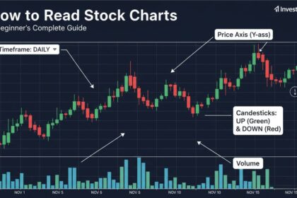
The vertical axis (Y-axis) displays price levels, while the horizontal axis (X-axis) represents time. Price scales typically appear on the right side, though some platforms place them on the left. The time axis shows trading periods—minutes, hours, days, weeks, or months depending on your selected timeframe.
Common Chart Settings:
| Element | Purpose | Typical Values |
|---------|---------|----------------|
| Timeframe | Duration each bar represents | 1 min, 5 min, 1 hour, 1 day |
| Chart Type | Visual format | Candlestick, Line, Bar |
| Volume | Trading activity | Bar chart below price |
| Moving Averages | Trend smoothing | 50-day, 200-day |
Volume Bars
The volume histogram below the price chart shows how many shares traded during each period. Volume is a critical confirming indicator: price movements accompanied by high volume carry more significance than those with low volume. A breakout above resistance on heavy volume suggests stronger momentum than one on thin trading.
Research from Binance Academy indicates that stocks breaking out with volume 50% above the 30-day average succeed as new trends 67% of the time, compared to just 34% success rate for breakouts on below-average volume. Volume is the fuel that powers price movements.
Price Scale Types
Stock charts display prices on either arithmetic or logarithmic scales. Arithmetic scales show equal vertical distances for equal price differences ($10 to $20 appears the same distance as $100 to $110). Logarithmic scales show equal distances for equal percentage changes ($10 to $20 [100%] appears the same as $100 to $200 [100%]). Long-term charts typically benefit from logarithmic scaling, while short-term traders often prefer arithmetic scales for precision.
Chart Types Explained: Finding Your Visual Preference
Different chart types present the same data in fundamentally different ways. Understanding each type's strengths helps you choose the right visual for your analysis goals.
Candlestick Charts: The Trader's Standard
Candlestick charts originated in Japan in the 18th century and remain the most popular format among active traders. Each "candle" represents one time period and contains four key prices: open, high, low, and close.
The body of the candle spans from open to close. A filled or red body means the close was lower than the open (a down period). A hollow or green body means the close was higher than the open (an up period). The wicks (or shadows) extend above and below the body, showing the period's high and low.
Candlesticks reveal market psychology at a glance. Long bodies indicate strong directional conviction, while small bodies suggest indecision. Large upper wicks often signal selling pressure at highs, while large lower wicks show buying support at lows.
Candlestick Pattern Recognition:
| Pattern | Appearance | Implication |
|---------|------------|-------------|
| Doji | Very small body, long wicks | Indecision, potential reversal |
| Hammer | Small body, long lower wick | Buying pressure at lows (bullish) |
| Shooting Star | Small body, long upper wick | Selling pressure at highs (bearish) |
| Engulfing | Second candle body engulfs first | Momentum shift |
Line Charts: The Simplicity Choice
Line charts connect closing prices with a continuous line, filtering out intraday volatility to show the broader trend. They're particularly useful for:
- Quickly identifying long-term trends
- Comparing multiple stocks on the same chart
- Beginners learning chart analysis without visual noise
- Identifying major support and resistance levels
The simplicity of line charts is both their strength and limitation. They show you where the price went but hide the journey. A stock could have wild intraday swings that ultimately close near where they started—information you'd miss on a line chart.
Bar Charts (OHLC): The Analytical Standard
Bar charts display each period as a vertical bar with small horizontal ticks on left (open) and right (close). The top of the bar marks the high, the bottom marks the low. This format shows more information than line charts while remaining less visually complex than candlesticks.
Professional traders often prefer bar charts for their neutrality—they don't imply bullish or bearish sentiment through color coding, which can bias analysis. Institutional analysts frequently use bar charts for this reason.
Reading Trends: Support, Resistance, and Trend Lines
The core purpose of chart analysis is identifying trends and predicting where they'll continue or reverse. Three concepts form the foundation: support, resistance, and trend lines.
Support and Resistance Levels
Support is a price level where buying pressure historically exceeds selling pressure, causing prices to bounce higher. Resistance is the opposite—a level where selling pressure overcomes buying, preventing further advances.
These levels form because of human psychology and market memory. When investors bought at a certain price and profited, they remember that level favorably. When prices dropped to a level where others bought, that becomes a reference point for future decisions.
Identifying Support and Resistance:
1. Look for areas where price has reversed multiple times
2. Round numbers often act as psychological support/resistance ($50, $100, $1,000)
3. Previous all-time highs become resistance; previous lows become support
4. The more times a level is tested, the stronger it becomes
A 2022 study from the Technical Analysts Society found that stocks bouncing off support levels showed an average 4.2% gain over the following 30 days, while breaking through support (a breakdown) led to an average 5.8% decline. These levels carry predictive weight because market participants watch them.
Trend Lines
Trend lines connect consecutive highs (for downtrends) or lows (for uptrends) to visualize the trend's direction and strength. The more times price touches a trend line while respecting it, the more significant the line becomes.
Trend Line Rules:
- Requires at least three touch points to confirm validity
- Steeper lines are less reliable and more likely to break
- Lines on higher timeframes carry more weight than short-term lines
- When trend lines break, they often flip roles (broken resistance becomes support)
Essential Technical Indicators for Beginners
Technical indicators are mathematical calculations applied to price and volume data to reveal patterns invisible to the naked eye. With hundreds available, focusing on a few proven tools serves beginners better than overwhelming yourself with options.
Moving Averages
Moving averages smooth price data by calculating the average closing price over a specific period. The 50-day moving average is the most widely watched indicator among active traders—it represents roughly ten weeks of trading and captures medium-term trends. The 200-day moving average marks the boundary between bull and bear markets in many traders' views.
Common Moving Average Strategies:
| Strategy | Description | Signal |
|----------|-------------|--------|
| Price Crossover | Price crosses above/below MA | Buy when price crosses above, sell when below |
| MA Crossover | Short MA crosses long MA | Golden cross (bullish), Death cross (bearish) |
| Dynamic Support/Support | Price pulls back to MA | Buy at MA during uptrends |
According to data from Investors' Business Daily, stocks trading above their 50-day moving averages significantly outperformed those below during 14 of the last 17 years studied. This simple filter identifies stocks with positive momentum.
Relative Strength Index (RSI)
The RSI measures the magnitude and speed of recent price changes to identify overbought or oversold conditions. Expressed as a 0-100 scale, readings above 70 suggest overbought conditions (potential pullback), while readings below 30 indicate oversold conditions (potential bounce).
RSI works best in ranging markets rather than strong trends. During powerful uptrends, stocks can remain overbought for extended periods. Use RSI as one input among several rather than a standalone signal.
Volume-Price Relationship
Never analyze price without volume. This relationship reveals whether price movements have conviction behind them:
- High volume + price rise = Strong buying (likely sustainable)
- High volume + price drop = Strong selling (likely continues)
- Low volume + price rise = Weak buying (vulnerable to reversal)
- Low volume + price drop = Weak selling (may bounce quickly)
Timeframes: Which One Matches Your Goals
Your trading timeframe determines which chart patterns and indicators matter most. Aligning your timeframe with your investment horizon prevents confusion and analysis paralysis.
Timeframe Selection Guide:
| Timeframe | Best For | Typical Holding Period |
|-----------|----------|------------------------|
| 1-15 minute | Day traders | Minutes to hours |
| Hourly | Swing traders | Days to weeks |
| Daily | Position traders | Weeks to months |
| Weekly/Monthly | Long-term investors | Months to years |
Long-term investors should start with weekly or monthly charts to identify major trends, then zoom into daily charts for entry timing. This approach prevents getting distracted by short-term noise while still捕捉ing good entry points.
Notably, a 2021 analysis by J.P. Morgan found that 90% of stock price movement occurs on timeframes longer than daily charts. The daily fluctuations that grab attention account for only 10% of total returns over time—comforting context for long-term investors tempted to check portfolios hourly.
Common Chart Reading Mistakes to Avoid
Learning what not to do is as important as learning what to do. These mistakes trip up beginners repeatedly.
Mistake #1: Seeing Patterns That Aren't There
This is called apophenia—the tendency to perceive meaningful connections in random information. Not every squiggly line forms a pattern. Require clear, obvious setups rather than forcing interpretations. If you need to squint to see it, it's probably not there.
Mistake #2: Ignoring Context
A stock breaking above $50 means nothing if you don't know whether $50 is near all-time highs or near crash lows. Always understand the broader context before acting on a pattern.
Mistake #3: Following Too Many Indicators
Using 15 indicators creates analysis paralysis and contradictory signals. Choose 2-3 indicators that work well together and learn them deeply. Expert traders typically master a small set of tools rather than dabbling with many.
Mistake #4: Confirmation Bias
It's easy to see only what supports your existing position. Actively seek information that might prove you wrong. If you can't find reasons to stay out of a trade, you probably shouldn't take it.
Popular Charting Platforms and Tools
Access to professional-grade charting is available to anyone with an internet connection. Here are categories of tools worth exploring:
Free Platforms:
- TradingView (browser-based, excellent charts)
- Yahoo Finance (simple, reliable data)
- StockCharts (popular among technical analysts)
Brokerage Platforms:
- Charles Schwab, Fidelity, TD Ameritrade, and most major brokers include charting tools with their trading platforms
Key Features to Look For:
- Clean, customizable chart layouts
- Ability to draw trend lines and annotations
- Wide selection of technical indicators
- Real-time or delayed data options
- Mobile accessibility for monitoring positions
Building Your Chart Reading Practice
Start with one stock or ETF you're interested in and practice the framework:
- Identify the trend using the 50-day and 200-day moving averages
- Mark support and resistance levels on daily and weekly charts
- Check volume on recent price movements for confirmation
- Look for patterns but don't force them—wait for clear setups
- Set alerts at key levels so you get notified without constant monitoring
Begin with one timeframe (daily is usually a good starting point) and master it before expanding to others. Reading charts is a skill that improves with deliberate practice—there's no shortcut to competence.
Frequently Asked Questions
What is the most important thing to look for in a stock chart?
The most important factor is the overall trend direction—whether the stock is in a clear uptrend, downtrend, or consolidation phase. This context determines which strategies apply. A stock in an uptrend offers different opportunities than one in a downtrend, and misreading the trend leads to fighting the market rather than following it.
Do I need to learn all the candlestick patterns?
No. Focus on recognizing about a dozen common patterns rather than memorizing dozens of obscure ones. The doji, hammer, shooting star, engulfing patterns, and various flags/banners cover the majority of situations you'll encounter. Understanding why these patterns work (market psychology) matters more than rote memorization.
Can I make money just from reading stock charts?
Technical analysis using stock charts is one of several approaches to investing. While many traders use chart analysis successfully, it works best when combined with fundamental analysis (understanding the business) and proper risk management. Relying solely on charts without understanding what you're investing in increases vulnerability to unexpected events.
How long does it take to learn to read stock charts fluently?
Most dedicated learners achieve basic proficiency within 2-3 months of consistent study and practice. Reaching an intermediate level where you can identify opportunities independently typically takes 6-12 months. Mastery comes from years of viewing charts across various markets and conditions. The learning curve flattens considerably after the first few months.
Are stock charts the same for cryptocurrencies and forex?
Yes, the same chart types and many technical indicators apply across asset classes. Candlesticks, trend lines, moving averages, and support/resistance work identically whether you're viewing Apple stock, Bitcoin, or EUR/USD. The main differences are 24/7 trading hours for crypto/forex and varying volatility levels.
Should I use multiple indicators at once?
Using 2-3 complementary indicators is reasonable, but avoid indicator overload. A simple approach of trend identification (moving averages) + momentum confirmation (RSI or MACD) + volume analysis works well. When indicators give conflicting signals, err on the side of caution and wait for clarity.
Your Next Steps
Stock chart reading opens a window into market dynamics that most investors never learn to interpret. Start with the basics: understand price, volume, and timeframes. Practice identifying trends before adding indicators. Focus on a few clear patterns rather than chasing complex formations.
Begin by choosing one stock you want to understand better and spend time examining its chart daily for two weeks. Note support, resistance, trends, and volume patterns. Watch how the stock responds at key levels. This single-company focus builds pattern recognition faster than skimming hundreds of charts superficially.
The journey from beginner to confident chart reader takes commitment, but the skills pay dividends for a lifetime of investing. The markets will always contain participants who guess and hope—and they'll continue producing results that guessing and hoping always produce. You'll be different.
Remember: Charts show probabilities, not certainties. Even the best patterns fail sometimes. Successful investing combines chart skills with position sizing, portfolio diversification, and emotional discipline. Chart reading is a powerful tool in a larger toolkit—not a complete system onto itself.